One of the premier legal anime streaming services, Crunchyroll has just embarked on a bold new chapter for its service with the U.S. rollout of Crunchyroll Beta. As with any large change in an established company, the drastically different look and changing features have understandably seen some resistance from fans and detractors alike. Yet this is one time where such a drastic change may not only be for the better, but a chance to make one's voice heard, making it more than worth a try.
While it's currently only available to Premium members, plans are in the works to release the site worldwide and to all Crunchyroll members. As the website's new layout is still a beta version, the developers and staff at Crunchyroll are listening to feedback from early adopters who "opt-in" to try it out.
The more people providing that feedback, the better and more user-friendly the site will become. There's even a handy "Leave Feedback" button along with the account options when users click on their avatar. But while feedback will be invaluable for improvements yet to come, the site has already come a long way forward as a platform.

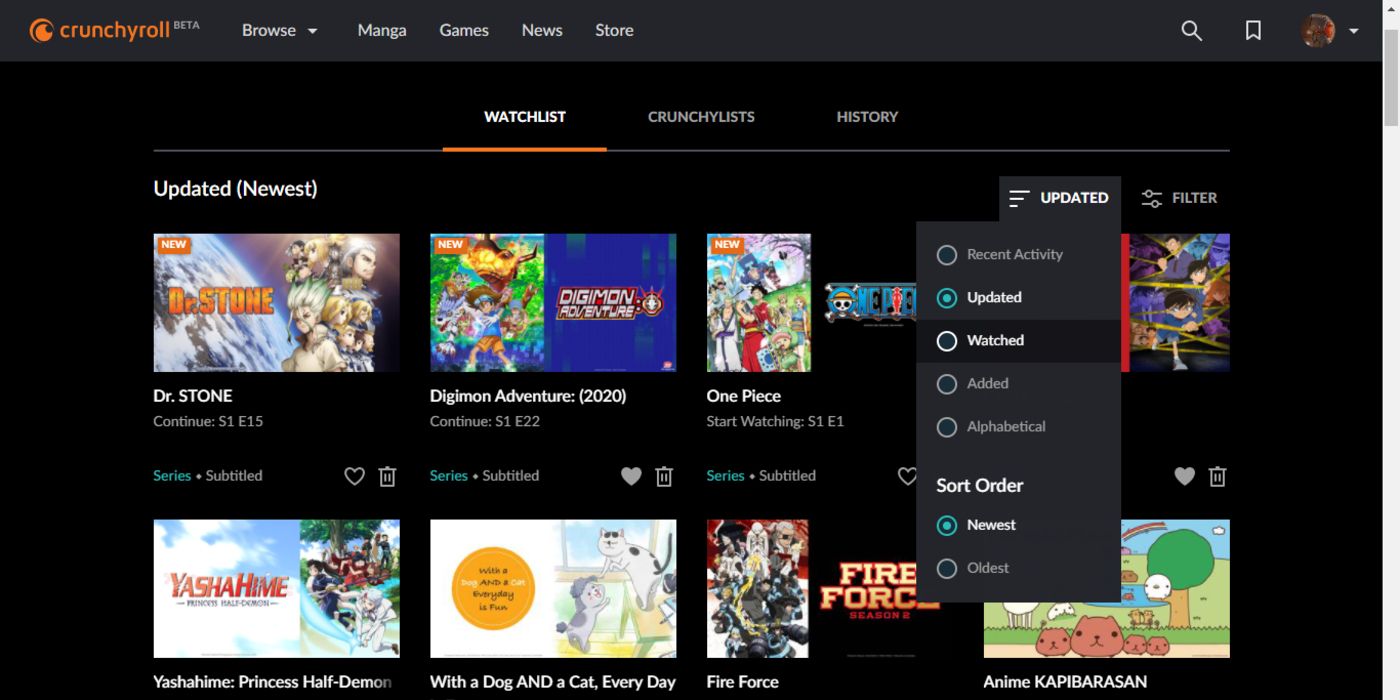
Of all the changes made, perhaps most important are those made to the watchlist and the advent of the Crunchylist. While they sound similar, they are two different features -- but both serve to make keeping on top of one's shows much easier. The Crunchylist brings back user-sorting capabilities, while the Watchlist has multiple automatic sorting options to make finding items in your queue as easy as clicking a few buttons.
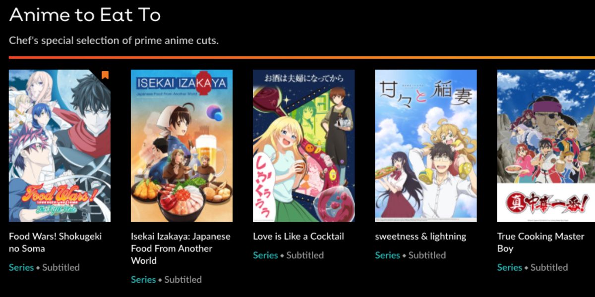
When it comes to discovering new shows, Crunchyroll has completely revamped its home page to show personalized recommendations in addition to unique categories, not unlike Netflix's scrolling categories. But while it appears similar on the surface, the more well-defined nature of focusing on anime has led to the creation of unique, likely hand-picked, categories, such as "Anime to Eat To," or "For SCIENCE!" But even with these categories, the element of search-and-discovery remains.
Unlike Netflix, which may show the same categories to its members over and over again, Crunchyroll has curated libraries of varied content not based on what one has previously watched -- which may prove invaluable. With broader categories like "Shojo," "Supernatural," and "Music," users can search through their preferred genre at that moment with ease, or even select "Alphabetical" to view all of the service's titles from A to Z. This will allow users to easily discover shows they may never have heard of before, and perhaps find a few hidden gems in the catalog.

Conveniently, Crunchyroll's front page now also contains users' own personal watchlist, shortening the amount of time needed to spend clicking about the website before diving right into the anime. Even if you do want to make sure that you're watching the most recent episode of So I'm a Spider, So What?, your queue and self-curated Crunchylists are never more than two clicks away from any page, with a shortcut to the watchlist appearing in the top menu bar, and a shortcut to the Crunchylists available after clicking on your avatar.
While the Beta version doesn't currently allow for uploading personal photos like the original site, the current stock library has plenty of characters and banners to select. From Crunchyroll's own Crunchy-Hime and her cat to recent releases like Somali and the Forest Spirit or the ever-cute Bananya, there's something for everyone.
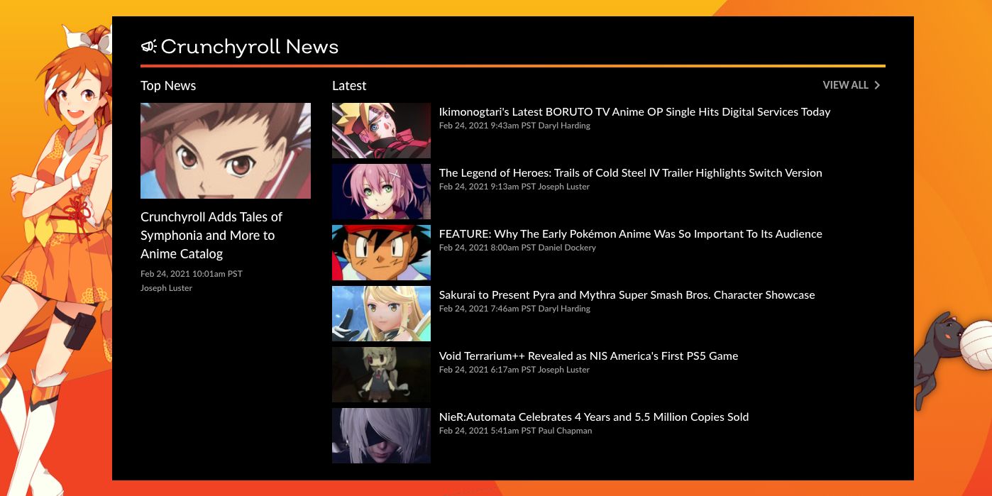
But while Crunchyroll seems to be emulating some of their competitors' style with the new home page's wall of content, a lot of what makes the service unique remains. News articles still grace the front page under the large carousel of current highlights, such as the newest Dr. Stone episode or a new item in the store. Likewise, unlike most streaming services which only host professionally-made content, Crunchyroll's comment section is not only active but thriving. Click on any episode of any series and there's bound to be plenty of people discussing it while making good use of the spoiler tag to do so. Likewise, the ability to leave a full-text review has remained, meaning that members looking for something new can read the various on-site reviews to determine whether a new series is for them or not.

Also among the features that stay the same are the same-day delivery of anime subbed in multiple languages for the medium's ever-growing international audience, as well as commitment to supporting the anime industry.
While it is true that not every part of the site has fully transitioned to the sleek new design -- with old profile pages and manga still showing up as the old site -- the parts that have converted work well and are generally easy and enjoyable to use. The video player allows for easy rewinding or skipping ahead as necessary, while also remembering where you were in an episode so you don't have to restart every time.
Also helpful is the site's new dark-mode-like color scheme. While the company's signature orange is still prominent, it's been toned down into an accented color. It stands out clearly against the black background, creating a modern look without getting rid of Crunchyroll's unique charm.
Overall, Crunchyroll Beta holds a lot of promise for those willing to try it out, with new many quality of life features that put the focus on actually watching the anime the service hosts. And as long as early adopters make sure to let the team know about any bugs or features they'd like to see implemented, it'll only get better from here.
0 Comments