
Modern box art can be fairly underwhelming. While some titles like Breath of the Wild have gorgeous cover art, that's far from the norm. Largely, modern box art falls into the market-tested trope of "protagonist brooding with a weapon." It's fairly archetypal, especially in comparison to the wild west that was early gaming box art. In particular, the NES era was home to some stunningly beautiful compositions, as well as some disastrously poor ones. And a few are so memorable that they remain iconic today, especially these five.
As these are the most iconic NES box arts, they aren't necessarily the best. While games like Kirby's Adventure and Dr. Mario have great illustrations, that doesn't make them inherently iconic. Sometimes it's the horrible composition or the story behind the piece that makes it special and still worth discussing in 2021.
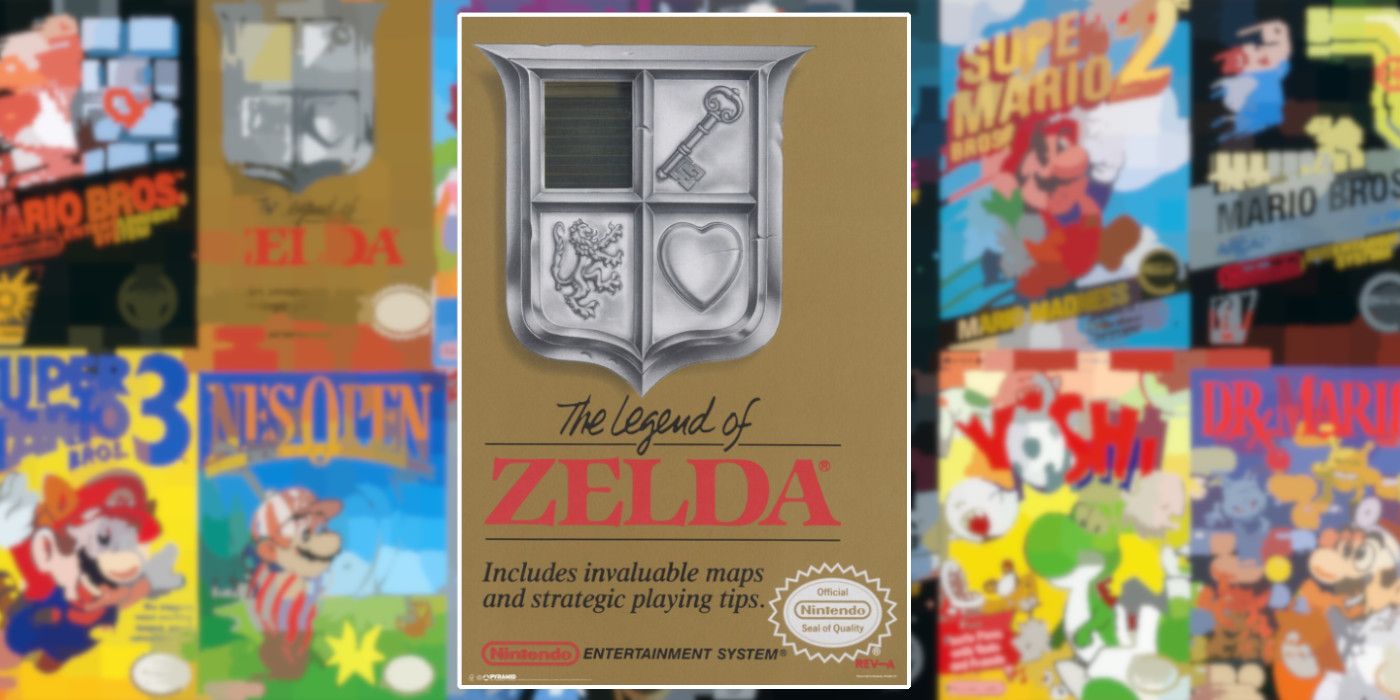
What's most interesting about The Legend of Zelda's box art is that it has one foot in both good and bad box art tropes. While the coat of arms is interesting, it communicates absolutely nothing about the game. It's not particularly ornate, either. However, there is an allure to its simplicity that piques the buyer's interest. It's simple and clean, not relying on anything flashy to sell the experience. Plus, the faded gold color of the background does look regal. It's this contradictory quality that has made The Legend of Zelda's box art so special, and it's certainly one of the NES era's most recognizable covers.
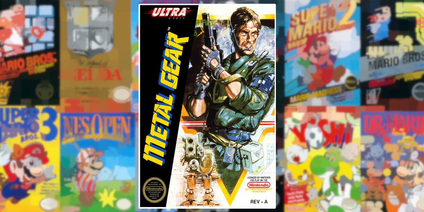
Long before Metal Gear Solid was released on PlayStation and shook the industry, Metal Gear existed as a far simpler experience on the MSX and NES. With Hideo Kojima at the helm, the older Metal Gear titles are still looked back on fondly, blemishes and all. These blemishes included a staple of NES development: notoriously poor translation. No one could forget the iconic line, "I feel asleep." No one could forget the other unfortunate symptom of early gaming that Metal Gear's box art exemplified either: blatant plagiarism. This box art is so iconic because it so obviously ripped off Kyle Reese from The Terminator, a feat that's equally funny and disappointing. A surprising number of NES box arts were plagiarized, and Metal Gear is certainly the most infamous example.
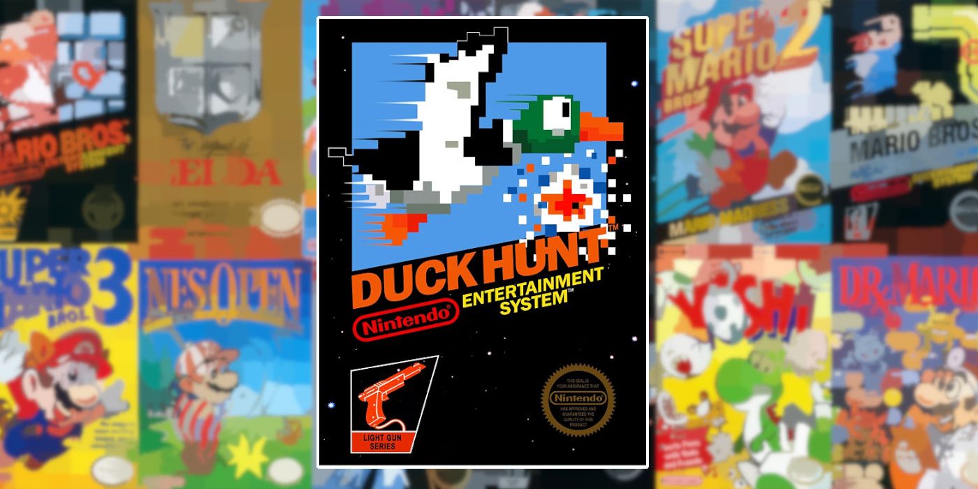
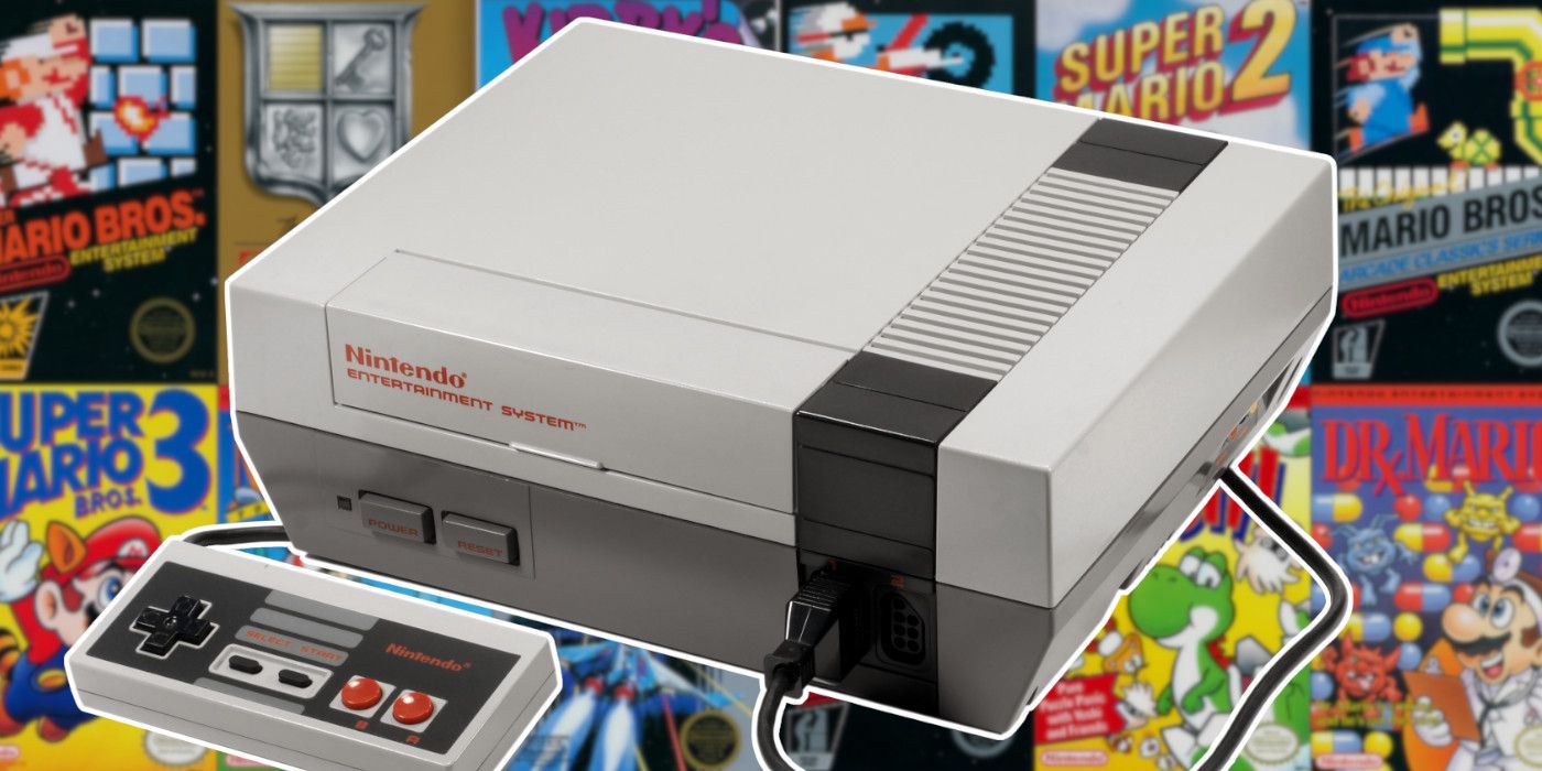
During the early NES era, Nintendo standardized box art. First, there was the black box, which was eventually followed by the grey box. The grey came later and was used for titles like Kid Icarus and Metroid. Both variants followed a similar structure: solid color, clear text, and pixel artwork representative of the game inside. Because many of the system's greats launched in these boxes, and the black boxes released alongside the console, they're incredibly iconic. While just about any black box NES game could take Duck Hunt's spot, the ubiquity of that title and the novelty of the NES Zapper makes it stand out particularly clearly.
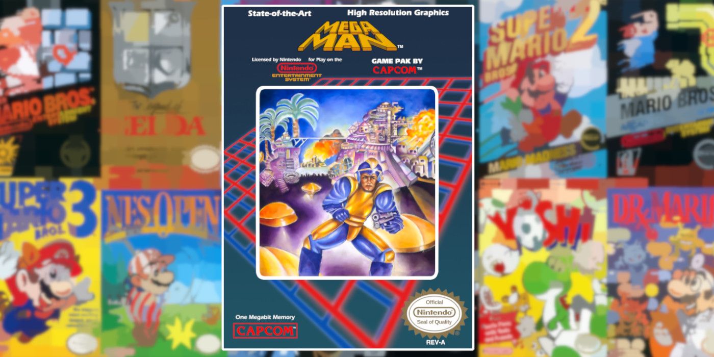
While Metal Gear's box art is iconic for being plagiarized, Mega Man's box art is iconic for being horrendous. It's barely representative of the actual game. Often, box art of the time was misleading, but it misled the consumer into thinking the game was better than it actually was. In Mega Man's case, the box art just didn't have the first idea of what the game was about. Its strange, off-kilter, bow-legged protagonist is the polar opposite of Mega Man himself. And, nothing about the composition highlights what makes the series special: its robot masters. While this isn't Mega Man's only brush with bad box art, it's easily one of the worst pieces in the entire NES library.
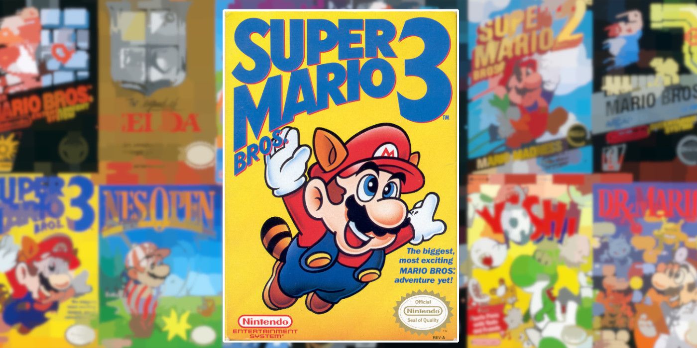
Not every box art can be Super Mario Bros. 3. Of the entire NES era, this may be the most iconic cover art. The success here is in its simplicity. While there is certainly a retro charm to the art for Super Mario Bros and more action in the art for Super Mario Bros. 2, they simply can't compete. Long before Cyberpunk 2077 changed the color yellow's connotation in gaming, the strikingly plain background for Mario 3 popped. It allowed the focus to remain on Mario, happily soaring with a Raccoon Leaf. The cover communicates Nintendo fun, and it housed one of the industry's very best platformers inside.
The highs of NES era box art are higher than modern box art, but the lows are far lower. It's a complicated but curious chapter of the industry's artwork, but not the golden era of it. That title arguably goes to the SNES era. While there were some head-scratchers like Phalanx, many more games from Yoshi's Island to Final Fantasy VI proved to be consistently stunning and iconic. The Super Famicom covers were even better in many cases too. Still, the NES era's cover art has a distinct and timeless charm, one worth revisiting time and time again.


0 Comments